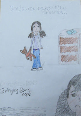
Our first fi lm poster makes good use of the colours black and white. This is because too much use of colour makes the film seem bright and quirky; and the point of Bringing Back Hope was to create a deep and dramatic atmosphere.
Dark colours such as blue were used for the font as it usually connotes the ideology of despair. However, the diary itself is coloured as it highlights its significance to viewers within the story; as Hope uses the diary to overcome her depressive state
Our second design makes use of brighter colours, but uses blue/purple-like hues. Even with the colours being slightly more brighter, it still shows that the film will be dealing with serious issues (such as bereavement and the loss of a loved one).
However, this film poster challenges the idea of despair as it uses a a bright yellow which usually connotes happiness. But by choosing to use this colour, it becomes apparent to the viewer that there may be a happy ending to the story (Hope overcoming her depressive state) as a mixture of dark and light colours are being used in this film poster.
This shot (Priscilla's crying scene) taken from the film clearly adheres to the idea of using darker hues to create a feeling of depression and isolation, which was what we were intending to re-create.
.
The review makes sufficient use of the colour blue, this also gives off the theme of despair as the colour blue could sometimes symbolise depression.


